Guide · artwork & materials
CMYK or RGB for printing?
Send CMYK. Screens make colour with light and presses make it with ink, and some of the colours your monitor can show simply do not exist in ink.
Two different ways of making a colour
A screen starts black and adds red, green and blue light. Add all three at full strength and you get white. That is RGB, and it is additive.
A press starts with white paper and adds cyan, magenta, yellow and black ink, each one subtracting light that would otherwise bounce back to your eye. Add all four and you approach a muddy black. That is CMYK, and it is subtractive.
Because they work in opposite directions, the sets of colours they can produce are different shapes. Some RGB colours have no CMYK equivalent at all — there is no ink mixture that produces them, at any price.
What we print for this
Proofed before they run
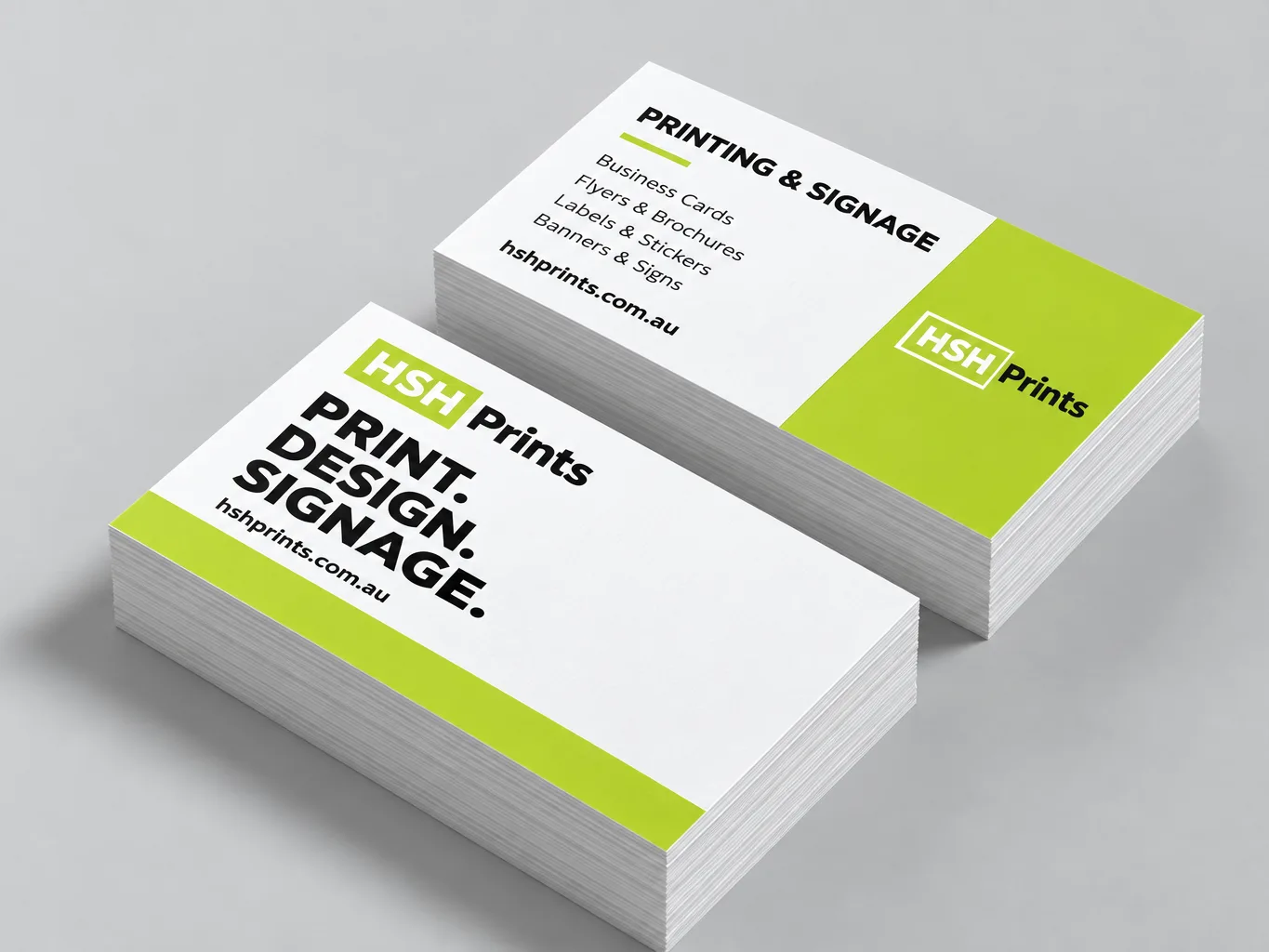
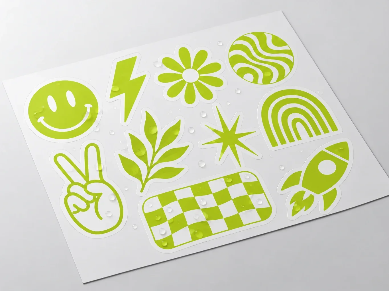
The colours that shift most
- Bright saturated blues are the classic. A vivid screen blue frequently prints noticeably purple, and it is the single most common complaint about print colour.
- Neon and fluorescent anything. Screens can show them; process ink cannot. They print as a dull approximation.
- Vivid greens and oranges lose some intensity.
- Deep blacks. 100% black ink alone prints as a flat dark grey over a large area. A rich black — roughly 60c 40m 40y 100k — looks properly black. Use plain 100k for body text, rich black for large solid areas.
Converting at the last minute is the worst option. If you design in RGB and convert on export, the software makes the decision about how each out-of-gamut colour is approximated, and it makes it after you have stopped looking. Set the document to CMYK at the start so you are choosing colours that can actually be printed.
Brand colours that must match
If a colour has to be exact — a logo, a corporate identity — the answer is a spot colour, typically specified as a Pantone. A spot colour is a specific premixed ink rather than an approximation built from four process inks, so it is consistent between jobs and between presses.
Spot colours cost more and are not available on every product or every press in the network, so tell us early. For most work, a well-chosen CMYK build is close enough that nobody but the brand owner would notice.
What to do
- Set the document to CMYK before you start designing.
- Convert photographs to CMYK yourself and look at what changed.
- Do not trust your monitor for absolute colour unless it is calibrated. It is not lying, it just cannot show you ink.
- Look at the proof. This is what the proof step is for — and it is the reason we send one before printing rather than after.
None of this replaces a printed sample if colour is genuinely critical. For a large or repeating job, ask us for one before the full run.
Common questions
Should I send CMYK or RGB artwork to a printer?
Send CMYK artwork to a printer, not RGB. A screen makes colour by adding red, green and blue light; a press makes it by adding cyan, magenta, yellow and black ink that each subtract light. Because they work in opposite directions, some colours a monitor can show have no ink mixture at all, at any price.
Why does my blue print purple?
Bright saturated blues are the colours that shift most between screen and press, and a vivid screen blue frequently prints noticeably purple. It is the single most common complaint about print colour. Neons and fluorescents are the other one: screens can show them, process ink cannot, and they print as a dull approximation.
When should I convert artwork to CMYK?
Set the document to CMYK before you start designing, not on export. Converting at the last minute is the worst option, because the software decides how each out-of-gamut colour is approximated and it makes that decision after you have stopped looking. Starting in CMYK means you are choosing colours that can actually be printed.
How do I get an exact brand colour in print?
Specify a spot colour, normally a Pantone, which is a specific premixed ink rather than an approximation built from four process inks. That makes it consistent between jobs and between presses. Spot colours cost more and are not available on every product, so tell us early. For most work a well-chosen CMYK build is close enough that nobody but the brand owner would notice.
What is rich black and when should I use it?
Rich black is black ink with cyan, magenta and yellow underneath it — roughly 60c 40m 40y 100k — and you use it for large solid areas. 100% black ink on its own prints as a flat dark grey once it covers any real area. Use plain 100k for body text, where a four-ink build would look soft if the plates shift even slightly.
Will the proof show me the real printed colour?
The proof shows you the file as it will be printed, which is where colour problems get caught — but no screen can show you ink. That is what the proof step is for, and it is why we send one before printing rather than after. If colour is genuinely critical on a large or repeating job, ask for a printed sample before the full run.
Should I use RGB or CMYK for screen?
RGB for anything shown on a screen, because screens make colour from red, green and blue light. CMYK is for print. If a design will be both, work in RGB for the screen version and convert a copy to CMYK for the printer, and expect bright blues and greens to look duller in print.
Next
Last updated .